
Hi, I'm Arnaud (@ArnaudDerosin). I am working as a Mobile Engineer at Nature and for this 12th day of the Nature Engineering Blog Festival I would like to share with you some informations about the Apple Watch screen sizes, it's a must to know for developing pixel perfect and multi-sizes supported Apple Watch screens!! Let me guide you through this article! 🎇
Environment
Introduction
After having encountered problems on placement with a TabView embedding subview on watchOS I've decided to make some research and tests.
If you already developed Apple Watch application you might have needed to know the size of the content to create application that match / adapt to all different screen sizes.
In this article I will synthesize and share my research that will allow you to optimize your development time. For those of you who are interested in measurements I will also explain how to proceed below.

Apple Watch - Design guidelines documentation: Designing for watchOS
Apple Watch supported sizes
At the time I am writing this article Apple Watch support 5 different sizes (38mm, 40mm, 41mm, 42mm, 44mm, 45mm)
To have a concrete idea of which Apple Watch series is related to each sizes here is a summary of sizes and latest supported OS.
| Apple Watch Series | Released with watchOS | Latest supported watchOS | Size (mm) |
|---|---|---|---|
| 1st Gen | watchOS 1.0 (iOS 8.2) | watchOS 4.3.2 (iOS 11.4.1) | 38, 42 |
| Series 1 | watchOS 3.0 (iOS 10.0) | watchOS 6.3 (iOS 13.7) | 38, 42 |
| Series 2 | watchOS 3.0 (iOS 10.0) | watchOS 6.3 (iOS 13.7) | 38, 42 |
| Series 3 | watchOS 4.0 (iOS 11.0) | watchOS 8.x (iOS 15.x) | 38, 42 |
| Series 4 | watchOS 5.0 (iOS 12.0) | Latest watchOS | 40, 44 |
| Series 5 | watchOS 6.0 (iOS 13.0) | Latest watchOS | 40, 44 |
| SE | watchOS 7.0 (iOS 14.0) | Latest watchOS | 40, 44 |
| Series 6 | watchOS 7.0 (iOS 14.0) | Latest watchOS | 40, 44 |
| Series 7 | watchOS 8.0 (iOS 15.0) | Latest watchOS | 41, 45 |
Different screen sizes
Before explaining more in detail the screen specificities and how to read the screen informations there is some term that is important to understand.
-
The rectangle represents the dimensions of the screen and may be different from the rectangle used to display your app’s content.
-
The safe area inset of the container view.
If these explanations still look unclear for you let me show you a visual representation with the Apple Watch 45mm.

Apple Watch different sizes summary
Before looking on how to measure them here is a summary of all different sizes that you can refer that will save you time on your watchOS development journey.
screenBounds sizes
| Size (mm) | width | height |
|---|---|---|
| 38mm | 136 | 170 |
| 40mm | 162 | 197 |
| 41mm | 176 | 215 |
| 42mm | 156 | 195 |
| 44mm | 184 | 224 |
| 45mm | 198 | 242 |
safeAreaInsets sizes
| Size (mm) | top | left | bottom | right |
|---|---|---|---|---|
| 38mm | 19 | 0 | 0 | 0 |
| 40mm | 28 | 0.5 | 28 | 0.5 |
| 41mm | 34 | 1 | 34 | 1 |
| 42mm | 21 | 0 | 0 | 0 |
| 44mm | 31 | 0.5 | 31 | 0.5 |
| 45mm | 35 | 1 | 35 | 1 |
content sizes (range where the content can be displayed)
| Size (mm) | width | height |
|---|---|---|
| 38mm | 136 | 151 |
| 40mm | 161 | 141 |
| 41mm | 174 | 147 |
| 42mm | 156 | 174 |
| 44mm | 183 | 162 |
| 45mm | 196 | 172 |
How to measure different sizes
screenBounds
In SwiftUI, it's very easy to measure the screenBounds (bounding rectangle of the screen).
You need to access the WKInterfaceDevice object that provides information about the current Apple Watch.
let screenBounds = WKInterfaceDevice.current().screenBounds

safeAreaInsets and container view size
To measure the size where your content can be safely displayed we need to use GeometryReader. (watchOS 6.0+)
GeometryReader provides us with an input value telling us the size (width and height we have available) and also the safeAreaInsets that we can then use with whatever calculations we need.
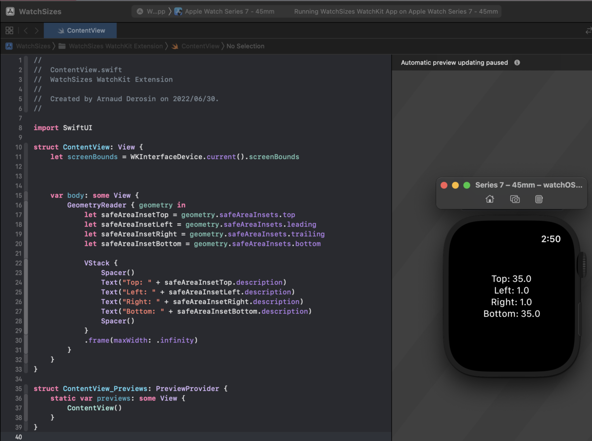
For some reasons, you might need to check the safeAreaInsets. Here is how you can check each of them.
let safeAreaInsetTop = geometry.safeAreaInsets.top
let safeAreaInsetLeft = geometry.safeAreaInsets.leading
let safeAreaInsetRight = geometry.safeAreaInsets.trailing
let safeAreaInsetBottom = geometry.safeAreaInsets.bottom
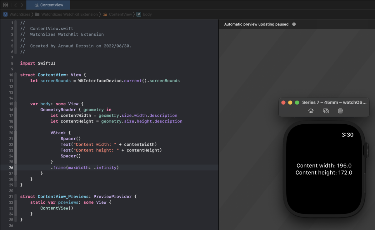
To get the size of the container view (available space where the content can be displayed), you could calculate (and might need to do in some cases) but geometryReader provide us this value:
let contentHeight = geometry.size.height.description
let contentWidth = geometry.size.width.description
On the screenshot below (test with45mm Apple watch) you can see that the available space is equal to:
width = screenBoundsWidth - (safeAreaInsetsLeft + safeAreaInsetsRight)
width = 198 - 2 = 196
height = screenBoundsHeight - (safeAreaInsetsTop + safeAreaInsetsBottom)
height = 242 - 70 = 172
Important: Since the screen is rounded for 40mm, 41mm, 44mm, and 45mm, the safeAreaInsetsBottom is also excluded.
The container view height on a 38mm or 42mm Apple Watch will be equal to:
height = screenBoundsHeight - safeAreaInsetsTop
38mm content available space will be:
width = 170 - 19 = 151
42mm content available space will be:
width = 195 - 21 = 174
Congratulation you are now a master of the Apple Sizes! 🎉
Edge case (Example with Tab View)
Let's consider that your view in embedded into a TabView.
Depending on your implementation, you might realize that even if your design match the actual content size, on some watch sizes it's being cropped at the top by few pixels or maybe getting shown under the TabView pager. 🤔
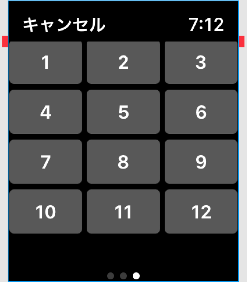
You might wonder why and the reason is because some Watch sizes are adding space to the bottom safeArea when a TabView is added (for a visual representation of each sizes, please look at the illustration added in the introduction section of the article).
38mm, 41mm and 42mm: +7
45mm is +8
If you work on some adaptive design and need some element to be changed / modified on certain sizes, you will need to create custom function and adapt your UI related to the device size.
It is up to you to implement these functions, but there will become useful on large Apple Watch application that still support watchOS < latest watchOS available.
That's it, I hope you enjoyed the article. Let's have fun making amazing Apple Watch apps. ⌚️🎉
We're hiring!
Nature is looking to expand our development team! If you are interested by the company vision and like challenges, why don't you talk with us?! Please see the recruitment information below for recruitment positions!
If you are interested in learning more about Nature's mission, services, organization, culture and benefits, please visit our Culture Deck below.