* English follows Japanese: Click here to read the article in English
v7.15.5
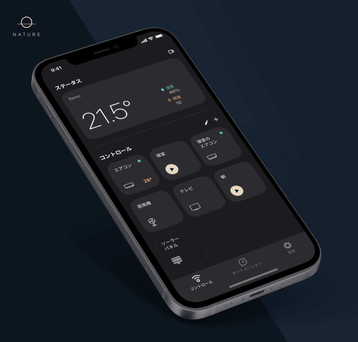
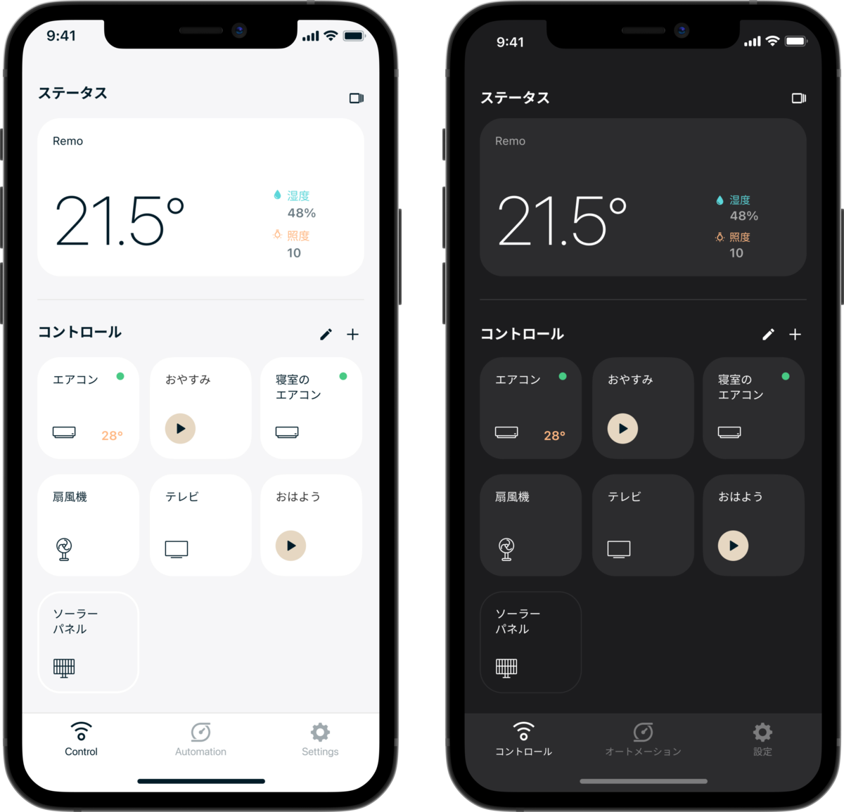
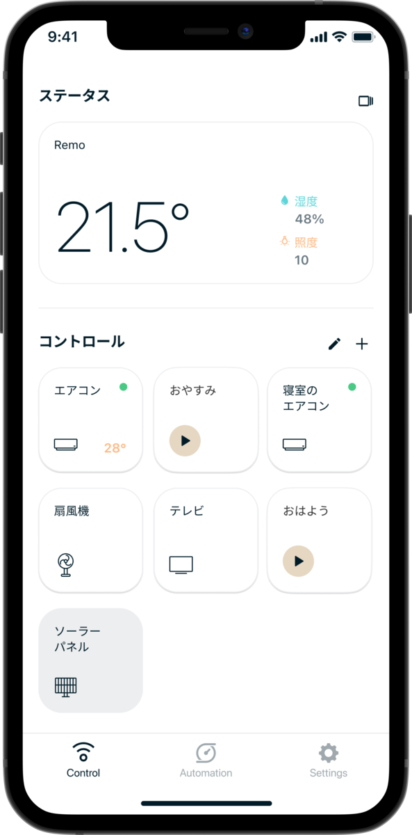
Nature Remo - デザインリニューアルとダークモード実装のお知らせ
はじめに
iOS 13.0(Apple)、Android 10(APIレベル29)以降、システム全体を暗くする「ダークモード(iOS)」「ダークテーマ(Android)」を選択することができるようになりました。ダークモード/テーマでは、システムはすべての画面、ビュー、メニュー、およびコントロールに暗いカラーパレットを使用します。暗い背景の中で前面のコンテンツを目立たせるために、より鮮やかな色彩を使用します。
ライトモード/ダークモードを使用することの利点や省電力は議論されていますが、私たちは、ユーザーの好みや使用シーンを重視することにしました。
この記事では読みやすさのため、今後はテーマとモードを「モード」という言葉に統一しています。
プロジェクトの始まり
iOS / Androidにダークモードが導入され、その人気から、Nature Remo アプリのダークバージョンを望むユーザーから要望が届いています。特に暗い環境でアプリケーションを使用する際に、目の疲れや不快感を感じるというフィードバックが繰り返し届いています。
この機能はユーザーにとって重要なものでしたので、アプリケーションのUIを更新すると同時にダークモードを実装することを決定しました。
私たちの目標は、常にUXを向上させることであり、UIの更新はすべてのフィードバックを元に慎重に行われています。アプリをより楽しんでいただくために、ライト/ダークモード機能はUIの更新と並行して開発しました。
アプリの現状
Nature Remoアプリはすでに3年以上React NativeとTypescriptで開発しています。React Nativeのバージョンアップとと当時からのアプリの設計により、実装中にいくつかの課題に直面しました。その1つは、アプリケーションがクラスコンポーネントと関数コンポーネントを使用しているということです。(クラスコンポーネントは開発中に関数型コンポーネントに書き換えられていますが、アプリケーションの複雑さにより、ダークモードの実装前に残りのクラスコンポーネントをすべて関数型に書き換えることはできませんでした)。
そこで今回は、Nature Remoアプリのモード選択機能について、私たちがどのように考えどのように設計したかを紹介したいと思います。
実装
ロジック
Reactコンポーネントのツリーに対して「グローバル」とも言えるデータを共有するために設計されたContextからモード選択を管理することにしたのですが、モード管理にはぴったりのユースケースでした。
export type CurrentTheme = 'light' | 'dark';
export type SelectedTheme = CurrentTheme | 'device_settings'

export interface ThemeContextInterface {
  current: CurrentTheme;
  selected: SelectedTheme;
}

export const ThemeContext = React.createContext<ThemeContextInterface>({
  current: 'light',
  selected: 'light',
});
Context Provider は、React コンポーネントで、Context の変更を受信するためのコンポーネントを提供します。
値として currentTheme (Light | Dark) と selectedTheme (Light | Dark | Device Setting) を渡しています。
import { CurrentTheme, SelectedTheme, ThemeContext } from './lib/Theme';

interface State {
  currentTheme: CurrentTheme;
  selectedTheme: SelectedTheme;
}
export default class App extends React.Component<{}, State> {
  render() {
    return (
      <ThemeContext.Provider value={{current: this.state.currentTheme, selected: this.state.selectedTheme}}>
        // Any component can read it, no matter how deep it is.
      </ThemeContext.Provider>
    );
  }
}
この2つの値を渡す理由は簡単で、アプリの実際のモードと、ユーザーがどれを選択したかを管理したいからです。
この段階で、Context の値のみで更新するのは最適な実装ではないことがわかりました。
当然ですがモードの設定はどこかに保存する必要があり、現在はreduxの永続層に保存されています。
そうなるとモードの設定がContextとreduxの二箇所で管理されることになってしまいます。
reduxのみで管理するようにしたかったのですが、既存のアプリの設計による制約もあり残念ながらこのタイミングできませんでした。そのためreduxの永続層でモードを管理し、一部のクラスコンポーネントのためにreduxからコンテキストを更新するという決定を下しました。
ユーザーが Light、Dark、Device Settings のいずれかのモードを選択すると、reduxを更新するactionがdispatchされます。Device Settings に対応する正しいモードを取得するために、アプリケーションの Appearance.getColorScheme()をチェックして正しい値を返す関数を作成しました。
export const getCurrentTheme = (selectedTheme: SelectedTheme) : CurrentTheme => {
  if (selectedTheme === 'device_settings') {
    const colorScheme = Appearance.getColorScheme();
    if (colorScheme === 'light' || colorScheme === 'dark') {
      return colorScheme;
    }
    else {
      return 'light';
    }
  }
  return selectedTheme;
}
各ビューは関数コンポーネントで作らられておりRedux StoreからcurrentThemeとselectedThemeを取得します
また、端末自身のモード変更にとアプリのモード変更を監視するために、ColorSchemeChangedとThemeChangedという2種類のコンポーネントを作成しました。
ThemeChangedコンポーネントはアプリの自身のモード(currentThemeとselectedTheme)を監視し、必要に応じてOSの外観設定(キーボード、アクションシートの色、アラート)/ステータスバーに関するユーザーインターフェイスを更新する役割を担っています。
ColorSchemeChangedコンポーネントは、端末自身のモード変更を監視します。
このコンポーネントは、useEffect フックを使用しており、端末自身のモードがデバイス上で変化し、実際のものと異なる場合に onChange コールバックをトリガーします。
外観が変更された場合、Redux Store で現在のモードを更新し、すべてのビューを「一度に」再レンダリングします。結果ThemeChangedコンポーネントの監視が発火します。
スタイル
色の管理及びメンテナンスを容易にし、再利用可能なコンポーネントを効率的に作成するために、モードごとに異なる色を定義する型を作成しました。
以下は、そのコードの一部です。
export type ColorInterface = {
  surface: {
    card: {
      default: string,
      pressed: string,
    },
    background: string,
  }
}
以下の例の通りLightColorsとDarkColorsは同じインタフェースを持ち独自の色を定義できる。
export const LightColors: ColorInterface = {
  surface: {
    card: {
      default: "#FFFFFF",
      pressed: "#F2F2F2",
    },
    background: "#F6F6F7",
  }
}

export const DarkColors: ColorInterface = {
  surface: {
    card: {
      default: "#2C2C2E",
      pressed: "#373738",
    },
    background: "#1C1C1E",
  }
}
Navbar / TabBar / StatusBar
ナビゲーションバーとタブバーの色の変更に対応するため、現在のモードをチェックして正しいスタイルをレンダリングする画面で、定義したスタイルを使用しています。
export const getThemedNavigation = (current: CurrentTheme) => {
  const themeColors = current === 'light' ? LightColors : DarkColors

  return {
    headerStyle: {
      backgroundColor: themeColors.surface.card.default
      borderBottomWidth: 0,
      shadowOpacity: 0,
      elevation: 0,
    },
    headerTitleStyle: current === 'light' ? LightTitleStyle : DarkTitleStyle,
    headerTintColor: themeColors.elements.primary.highEmphasis,
    cardStyle: { backgroundColor: themeColors.surface.background }
  }
}
使用例:
class AutomationsScreen extends React.Component<Props, State> {
  static navigationOptions: NavigationOptions<NavigationStackScreenProps, NavigationStackOptions> = ({ navigation, theme }) => {
    return {
      ...getThemedNavigation(theme),
      title: 'Automations'
    }
  };
}
StatusBarについては、App componentdidMount()のライフサイクルで、Redux Storeから取得したcurrentThemeからステータスバーの色を更新しています。
export default class App extends React.Component<{}, State> {
  state: State = {
    currentTheme: store.getState().account.currentTheme,
    selectedTheme: store.getState().account.selectedTheme,
  }

  componentDidMount() {
    updateThemedStatusBar(this.state.currentTheme);
  }
}
ユーザーが選択したモードを変更する場合、そのモードが明るいか暗いか、またはデバイスの設定かを確認し、必要な変更を加えて、アプリモードに合わせたステータスバーに更新しています。
デザイナーとの連携
2021年の3Qにダークモードの機能をゼロから実装することにしました。そのためデザイナーと効率的に作業する方法を模索する必要がありました。
ダークモードをデザインする前に、まず私達はライトモードを作りました。以前のライトモードは背景色が白で各UIコンポーネントも白が使われていました。背景色と各UIコンポーネント間のコントラストを改善するために、全ページの背景色をライトグレーに更新しました。驚くことにこの変更はほとんどのユーザ気づかれず自然に行われました。これによりダークモードを作る準備ができました。
ライトとダークの実装のために、アプリのUIリニューアルと同時にUIコンポーネントの一貫性を保ち最適化するため必要がありました。デザイナーとエンジニアの間で毎日行われるミーティングレビューにより、非常に良い実装フローを保つことができました。しかしながらアプリには古いコンポーネントと新しいコンポーネントが混在したため困難を極めました。
この間、エンジニアはページのリニューアルやライトモード(背景がグレー)の実装を進めていました。デザイナーは常に一歩先を行き、アプリのメインページであるコントロール、エネルギー(RemoEを利用するユーザー向け)及びオートメーションをデザインし、独自の機能を持つこれらのページでダークモードがどう見えるかのおおよその見当をつけることが出来ました。
エンジニアの重要な役割は、再利用不可能なコンポーネントをすべて特定し、デザイナーがこれらのページにリソースを集中させることでした。このように、デザイナーが開発よりも先行してリズムを刻むことで、日々新しいページを実装し、どのページにデザイナーがもっと注意を払う必要があるのかをピンポイントで把握することができるようになりました。
We are hiring
Nature では Nature Remo, Nature Remo E, Nature スマート電気を組み合わせ新しい体験を提供していきたいと思っています。 カジュアル面談も常に募集していますので興味がある方は是非話してみませんか。
herp.careers
NATURE REMO DESIGN RENEWAL AND DARK MODE IMPLEMENTATION
Introduction
Since iOS 13.0 for Apple users and Android 10 (API level 29) for Android users, people can choose to adopt a dark system-wide appearance called Dark Mode (iOS) / Dark Theme (Android). In Dark Mode / Theme, the system uses a darker color palette for all screens, views, menus, and controls. It uses more vibrancy to make foreground content stand out against the darker backgrounds.
Aside from the advantages and performances of using light / dark mode that are debated, we decided to focus on the preferences of our users and what they are requesting us.
* For the sake of readability, theme and mode will be replaced by the term “mode” in this article.
Origin of the project
Since the native Dark Mode introduction for iOS / Android and its rise in popularity, we gradually have received feedback about users that would love to have a dark version of the Nature Remo app. Some recurrent feedback are mentioning eye strain and discomfort when using the application in dark environments.
This feature was important for our users, so we decided to implement the dark mode at the same time we were implementing the new design of the application.
Our goal is to always improve the user experience, the interface renewal is a very important step that we are implementing carefully after reading all the feedback. To allow our users to enjoy the app even more, the light / dark mode feature was a crucial implementation that we accomplished in parallel of the design renewal.
Actual app state
The Nature Remo app was developed with React Native in Typescript for the past 3 years, the evolution of React and the app structure confronted us with certain challenges during implementation, one of them is that the application is using class and functional components. (class components are being rewritten to functional components during our developments but the complexity of the application doesn’t allowed us to rewrite all the remaining class components to functional before the implementation of dark mode).
So today we want to share with you the way we thought and designed the appearance selection feature in the Nature Remo app.
Implementation
Logic
We decided to manage the mode selection from the Context which is designed to share data that can be considered “global” for a tree of React components, the mode management was a great use case.
export type CurrentTheme = 'light' | 'dark';
export type SelectedTheme = CurrentTheme | 'device_settings'

export interface ThemeContextInterface {
  current: CurrentTheme;
  selected: SelectedTheme;
}

export const ThemeContext = React.createContext<ThemeContextInterface>({
  current: 'light',
  selected: 'light',
});
We wrapped up the application component tree with the Context Provider, which is a React component that permit consuming components to subscribe to Context changes.
We are passing as value the currentTheme (Light | Dark) and the selectedTheme that can be Light | Dark | Device Setting.
import { CurrentTheme, SelectedTheme, ThemeContext } from './lib/Theme';

interface State {
  currentTheme: CurrentTheme;
  selectedTheme: SelectedTheme;
}
export default class App extends React.Component<{}, State> {
  render() {
    return (
      <ThemeContext.Provider value={{current: this.state.currentTheme, selected: this.state.selectedTheme}}>
        // Any component can read it, no matter how deep it is.
      </ThemeContext.Provider>
    );
  }
}
The reason for passing these two values is simple, we want to keep tracking of the actual mode of the app and also the user selection.
At this stage, we realized that working only with the Context values was not the best implementation. Of course, the selected mode needs to be stored somewhere, and currently it is stored in the Redux persistence layer.
This means that the mode settings are managed in two places, Context and Redux.
We would have liked to manage it only in Redux, but unfortunately we couldn't do it at this time due to the limitations of the existing application design. So we made the decision to manage the mode in the Redux persistence layer and update the Context from Redux for some class components.
When the user selects one of the Light, Dark, or Device Settings modes, an action is dispatched to update redux. In order to get the correct mode corresponding to Device Settings, we created a function that checks Appearance.getColorScheme() in the application and returns the correct value.
export const getCurrentTheme = (selectedTheme: SelectedTheme) : CurrentTheme => {
  if (selectedTheme === 'device_settings') {
    const colorScheme = Appearance.getColorScheme();
    if (colorScheme === 'light' || colorScheme === 'dark') {
      return colorScheme;
    }
    else {
      return 'light';
    }
  }
  return selectedTheme;
}
Each view is using a custom function that is returning the currentTheme and selectedTheme from the Redux Store.
To manage the application appearance update on native mode change, we have created two different functions, one named ColorSchemeChanged and another one named ThemeChanged.
ThemeChanged is in charge of updating the local state of the app (current and selected) and also if necessary update the user interface related to OS appearance preferences (keyboard, action sheet colors, alert) / status bar.
The ColorSchemeChanged function is responsible for updating the current mode of the application. The function is using an useEffect hook that triggers an onChange callback if the native mode appearance changes on the device and differs from the actual one. If the appearance changed, we update the current mode on the Redux Store that re-render all our views at "once".
Style
To be able to manage, maintain the colors easily and make efficient reusable components we have created a type defining the colors that differs on each mode.
Here is a part of the code that we are using:
export type ColorInterface = {
  surface: {
    card: {
      default: string,
      pressed: string,
    },
    background: string,
  }
}
Following this example, light colors and dark colors are typed annotated and define their own colors from this type.
export const LightColors: ColorInterface = {
  surface: {
    card: {
      default: "#FFFFFF",
      pressed: "#F2F2F2",
    },
    background: "#F6F6F7",
  }
}

export const DarkColors: ColorInterface = {
  surface: {
    card: {
      default: "#2C2C2E",
      pressed: "#373738",
    },
    background: "#1C1C1E",
  }
}
Navbar / TabBar / StatusBar
To handle the change of colors of the Navigation Bar / Tab Bar, we have imported our defined styles in the screens where we need to check the current mode and render the right style.
export const getThemedNavigation = (current: CurrentTheme) => {
  const themeColors = current === 'light' ? LightColors : DarkColors

  return {
    headerStyle: {
      backgroundColor: themeColors.surface.card.default
      borderBottomWidth: 0,
      shadowOpacity: 0,
      elevation: 0,
    },
    headerTitleStyle: current === 'light' ? LightTitleStyle : DarkTitleStyle,
    headerTintColor: themeColors.elements.primary.highEmphasis,
    cardStyle: { backgroundColor: themeColors.surface.background }
  }
}
Example of usage:
class AutomationsScreen extends React.Component<Props, State> {
  static navigationOptions: NavigationOptions<NavigationStackScreenProps, NavigationStackOptions> = ({ navigation, theme }) => {
    return {
      ...getThemedNavigation(theme),
      title: 'Automations'
    }
  };
}
For the StatusBar, on the App componentdidMount() lifecycle we are updating the status bar color from the currentTheme that we are getting from the Redux Store.
export default class App extends React.Component<{}, State> {
  state: State = {
    currentTheme: store.getState().account.currentTheme,
    selectedTheme: store.getState().account.selectedTheme,
  }

  componentDidMount() {
    updateThemedStatusBar(this.state.currentTheme);
  }
}
If the user is making a change in the selected mode, we are checking if the mode is light, dark or device settings and then making the necessary changes to update the status bar related to app mode.
Workflow with the designer
We’ve decided to implement the dark mode functionality from scratch during the Q3 of 2021, to respect that deadline we had to find a way to work efficiently with the designer to optimize our time and progress.
The implementation of two different appearances (light and dark) had to be done during the design renewal of the application to make sense and optimize the consistency of elements in the app. A daily meeting review between designers and engineers allows us to keep a very good implementation flow.
Before designing the Dark Mode, the first step was to create and implement a Light Mode for the application and finally add contrast, we originally thought all the new design with the grey background to improve the contrast between elements but because we didn’t want to impose to our users some difference of color between renewed pages and old ones, we first implemented the renewal of main pages with a white background (which involve to change other elements). During that implementation, we designed components like buttons and cells to be reusable and easy to update at once when we switched all the pages background to a light grey color.
During the time engineers were implementing renewal of pages and light mode (grey background). The designer always worked one step further and designed the main pages of the Nature Remo app like Control, Energy (for users who use the RemoE) and Automation to have a rough idea of how the dark mode will look on these pages that feature more unique functionalities.
An important role of the engineers was to identify all the components that were not reusable to focus the designer resources on these pages. By keeping this rhythm where the designer was ahead of the development, it allows us to implement new pages on a daily basis and pinpoint which page might need more attention from the designer.
Recruitment
Nature is looking to expand the team from 30 to 100 people! If you are interested by the company vision and like challenges, why don't you talk with us?!
Please see the recruitment information below for recruitment positions!
herp.careers
Written by: Arnaud Derosin
Reviewed and translated by: Kyosuke Kameda